Building a Drag-and-Drop List with React and dnd-kit/core
Implement a seamless drag-and-drop list in React using dnd-kit/core, with a walkthrough of the core code and styling.
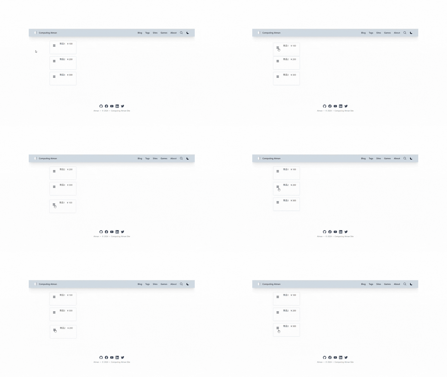
Drag-and-drop is a common feature in modern web applications, letting users reorder items seamlessly. In this tutorial, we'll explore how to implement drag-and-drop functionality in a React application using the dnd-kit/core library. We'll use this library's core components to build a simple sortable list of draggable items.
Project Setup
Before diving into the implementation, let's install the required dependencies. Install @dnd-kit/core in your React project.
npm i @dnd-kit/core @dnd-kit/sortable
From here, we'll build out the components for our draggable list.
Creating the DraggableList Component
The DraggableList component acts as the container for the draggable items. Here's the code for the DraggableList.tsx file:
DraggableList.tsx(DraggableList)
import {
  DndContext,
  KeyboardSensor,
  PointerSensor,
  UniqueIdentifier,
  closestCenter,
  useSensor,
  useSensors
} from '@dnd-kit/core';
import {
  SortableContext,
  horizontalListSortingStrategy,
  rectSortingStrategy,
  sortableKeyboardCoordinates,
  useSortable,
  verticalListSortingStrategy
} from '@dnd-kit/sortable';
import { CSS } from '@dnd-kit/utilities';
import { ComponentProps, FC, ReactNode, useMemo } from 'react';

export interface HasId {
  id: UniqueIdentifier;
}

type Props<T extends HasId> = {
  items: T[];
  onDragStart?: ComponentProps<typeof DndContext>['onDragStart'];
  onDragEnd?: ComponentProps<typeof DndContext>['onDragEnd'];
  onDragOver?: ComponentProps<typeof DndContext>['onDragOver'];
  layout: 'horizontal' | 'vertical' | 'grid';
  children: ReactNode;
};
// ドラッグ&ドロップ可能なリストアイテム
export const DraggableList: FC<Props<HasId>> = ({
  items,
  onDragStart,
  onDragEnd,
  onDragOver,
  layout,
  children
}) => {
  // ドラッグ&ドロップする時に許可する入力
  const sensors = useSensors(
    useSensor(PointerSensor),
    useSensor(KeyboardSensor, {
      coordinateGetter: sortableKeyboardCoordinates
    })
  );

  // リストの種類
  const strategy = useMemo(() => {
    switch (layout) {
      case 'horizontal':
        return horizontalListSortingStrategy;
      case 'vertical':
        return verticalListSortingStrategy;
      case 'grid':
      default:
        return rectSortingStrategy;
    }
  }, [layout]);

  return (
    <DndContext
      sensors={sensors}
      collisionDetection={closestCenter}
      onDragStart={onDragStart}
      onDragEnd={onDragEnd}
      onDragOver={onDragOver}
    >
      <SortableContext items={items} strategy={strategy}>
        <ul>{children}</ul>
      </SortableContext>
    </DndContext>
  );
};
This component sets up the DndContext and SortableContext provided by @dnd-kit/core. It also defines the DraggableItem component that wraps each item in the list.
Building the Draggable Item
Each draggable item in the list is represented by the DraggableItem component. It also includes a DraggableHandle to improve the user interaction. Here's the code:
DraggableList.tsx(DraggableItem)
// ドラッグ&ドロップ可能なリストアイテム
export const DraggableItem: FC<{
  id: HasId['id'];
  children: ReactNode;
}> = ({ id, children }) => {
  const { setNodeRef, transform, transition } = useSortable({ id });

  const style = {
    transform: CSS.Transform.toString(transform),
    transition
  };

  return (
    <li ref={setNodeRef} style={style}>
      {children}
    </li>
  );
};

// MyDraggableItemをドラッグ&ドロップするためのハンドル
export const DraggableHandle: FC<{
  id: HasId['id'];
  children: ReactNode;
}> = ({ id, children }) => {
  const { attributes, listeners } = useSortable({ id });

  return (
    <div {...attributes} {...listeners}>
      {children}
    </div>
  );
};
This component uses the useSortable hook from @dnd-kit/core to handle the drag-and-drop behavior.
Implementing Drag-and-Drop in the Page Component
In the main page component (page.tsx), we import and use DraggableList to build a draggable list of products. Here's the code:
This uses Next.js, so it's named
page.tsx, but it works just as well as a regular React component.
'use client';

import { DragEndEvent, DragStartEvent } from '@dnd-kit/core';
import { faBars } from '@fortawesome/free-solid-svg-icons';
import { FontAwesomeIcon } from '@fortawesome/react-fontawesome';
import { FC, useCallback, useState } from 'react';
import { DraggableHandle, DraggableItem, DraggableList } from './_components/DraggableList';

// リソース:商品の型
type Product = {
  id: string;
  name: string;
  price: number;
};

const Products = [
  {
    id: '1',
    name: '商品1',
    price: 100
  },
  {
    id: '2',
    name: '商品2',
    price: 200
  },
  {
    id: '3',
    name: '商品3',
    price: 300
  }
];

// 商品を表示するリストアイテム
const ProductItem: FC<{
  product: Product;
}> = ({ product }) => (
  <DraggableItem id={product.id}>
    <div className="m-4 h-[100px] w-[200px] items-center rounded-md border-2 p-2 shadow-sm">
      <div className="flex space-x-4">
        <DraggableHandle id={product.id}>
          <FontAwesomeIcon icon={faBars} className="m-4" size="lg" />
        </DraggableHandle>
        <p>{product.name}</p>
        <p>¥ {product.price}</p>
      </div>
    </div>
  </DraggableItem>
);

// ドラッグ&ドロップ可能な商品リスト
const Page = () => {
  // 一覧表示する商品群
  const [products, setProducts] = useState<Product[]>(Products);

  const onDragStart = useCallback((e: DragStartEvent) => {
    console.log('onDragStart', e);
  }, []);

  const onDragEnd = useCallback((e: DragEndEvent) => {
    console.log('onDragEnd', e);
  }, []);

  return (
    <DraggableList
      items={products}
      onDragStart={onDragStart}
      onDragEnd={onDragEnd}
      layout={'vertical'}
    >
      {products.map((product) => (
        <ProductItem key={product.id} product={product} />
      ))}
    </DraggableList>
  );
};

export default Page;
This component renders a list of products, and the onDragStart and onDragEnd callbacks log the corresponding events to the console.
Styling and Customization
Feel free to customize the styling of the draggable items to match your application's design. The provided code includes basic styling using Tailwind CSS.
Summary
In this tutorial, we implemented a simple draggable list using react and @dnd-kit/core. This library provides a robust toolset for handling drag-and-drop interactions, making it easy to build a seamless user experience.
You can take this implementation further with animations, custom drag handles, and more. Explore the @dnd-kit/core documentation for additional options and possibilities.
Related plants
More Tech articles →How to Create Sortable & Droppable Components with dnd-kit
Learn how to implement both useSortable and useDroppable in dnd-kit. A practical guide to achieving container reordering and item dropping simultaneously through conditional logic.
#react#dnd-kit#typescriptVerifying GitHub Copilot Code Review Features: Applying Custom Rules and Controlling Output
This article explains the results of verifying whether GitHub Copilot can recognize and point out project-specific rules, and how to control output using prompt engineering.
#github-copilot#code-review#typescriptRedux / Zustand / Jotai Implementation Comparison Guide
A guide that compares the implementation patterns of Redux, Zustand, and Jotai in React apps by use case and organizes the perspectives for choosing between them.
#react#state-management#redux